Design for Three Formats
Since the fifties, album cover artwork has been an integral part of not just an album's marketing, but its very identity. Although cassettes had been on the ascendant since the early seventies, designers had rarely given a second thought to their design, the LP remained the principal canvas.
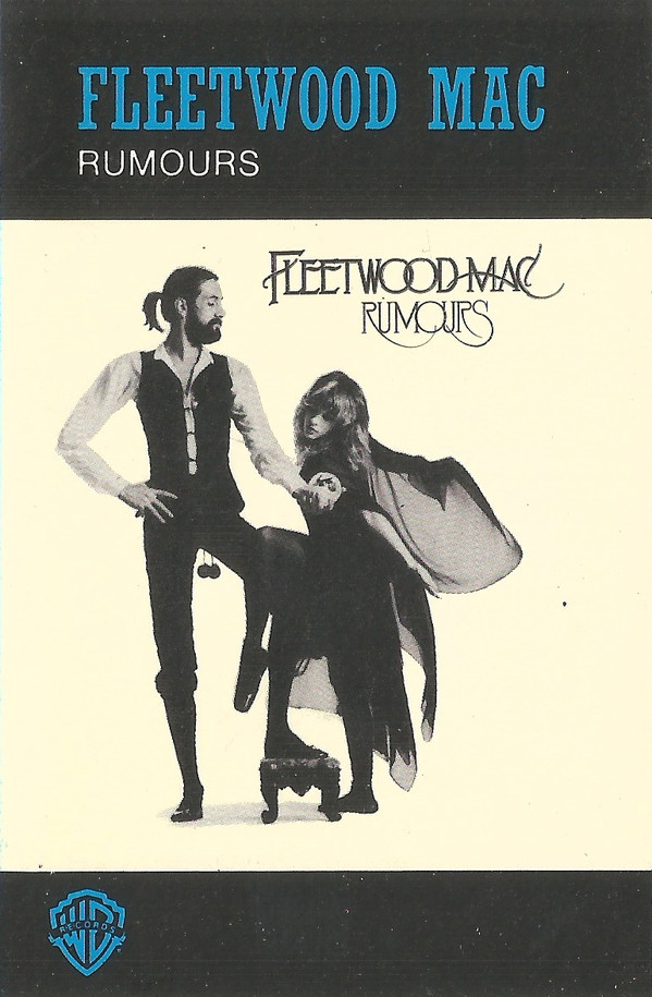
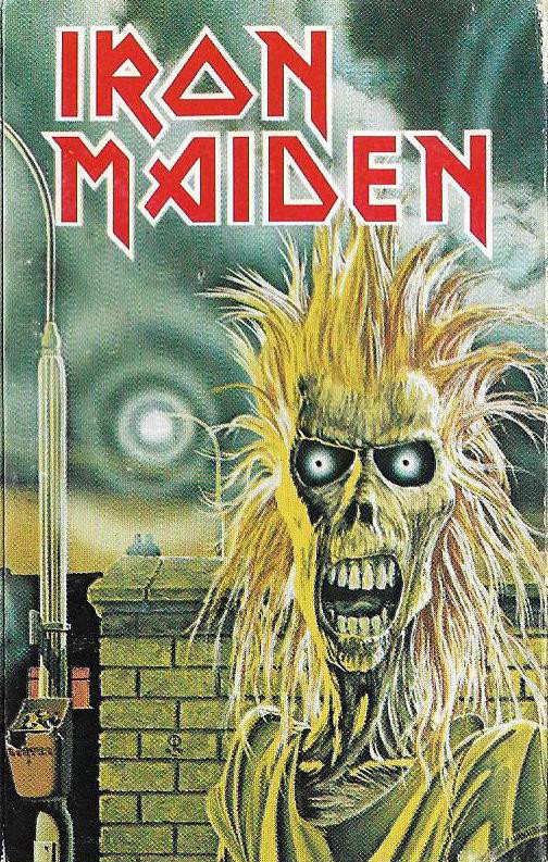
Designers would often simply scale down the LP artwork to fit the rectangular cassette cover with titles, label marks and even track-listings filling up the remaining space. Alternatively, LP artwork was cropped to fit, losing much of the original design.
For a brief period from the mid-eighties to the mid-nineties music was sold in three major formats with none being especially dominant. Occasionally designers met the challenge of these different sizes and shapes and created unique artwork for each format, generating a rare narrative between them.
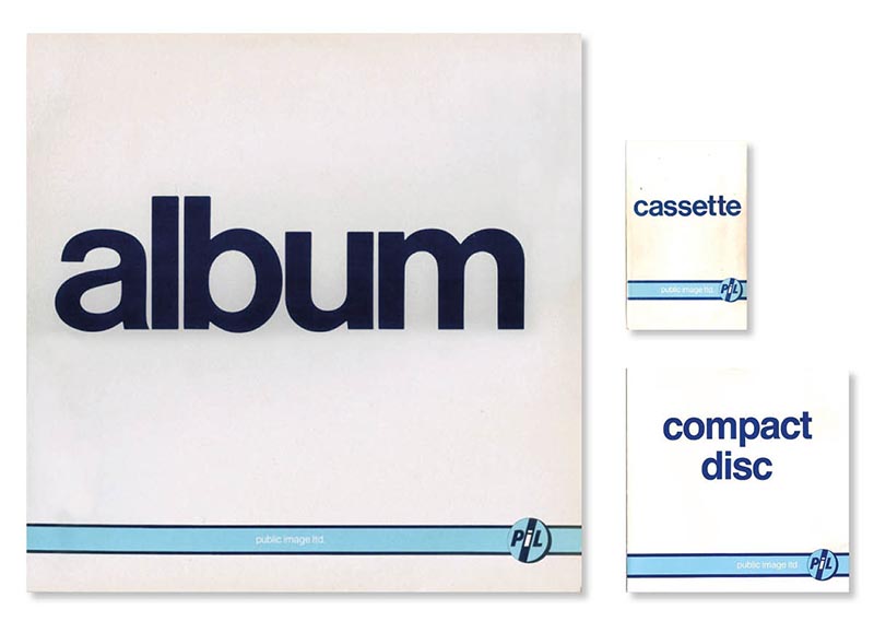
Public Image Ltd - album (1986)
Given the faux-generic nature of the artwork for PIL's 1986 album (modelled after blank cassette inlays), creating the alternative for the LP was not only straightforward but wholly keeping in line with the design's ethos. The CD followed in 1988.
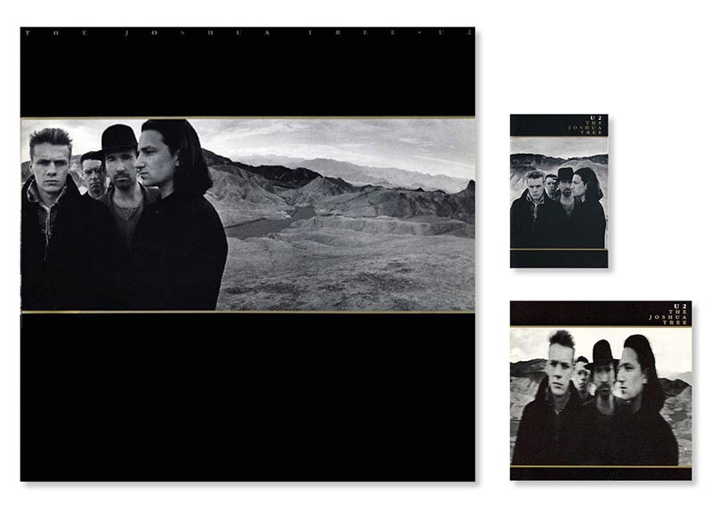
U2 - The Joshua Tree (1987)
Few bands were as in control of their image as U2 were in the eighties. The cover for their blockbuster LP boldly points to the cinematic nature of the music within. For the other two formats a recomposition and alternative portraits were used. The inexplicably blurry photo used for the CD was a mis-step, and later reissues reverted to a reproduction of the LP artwork.
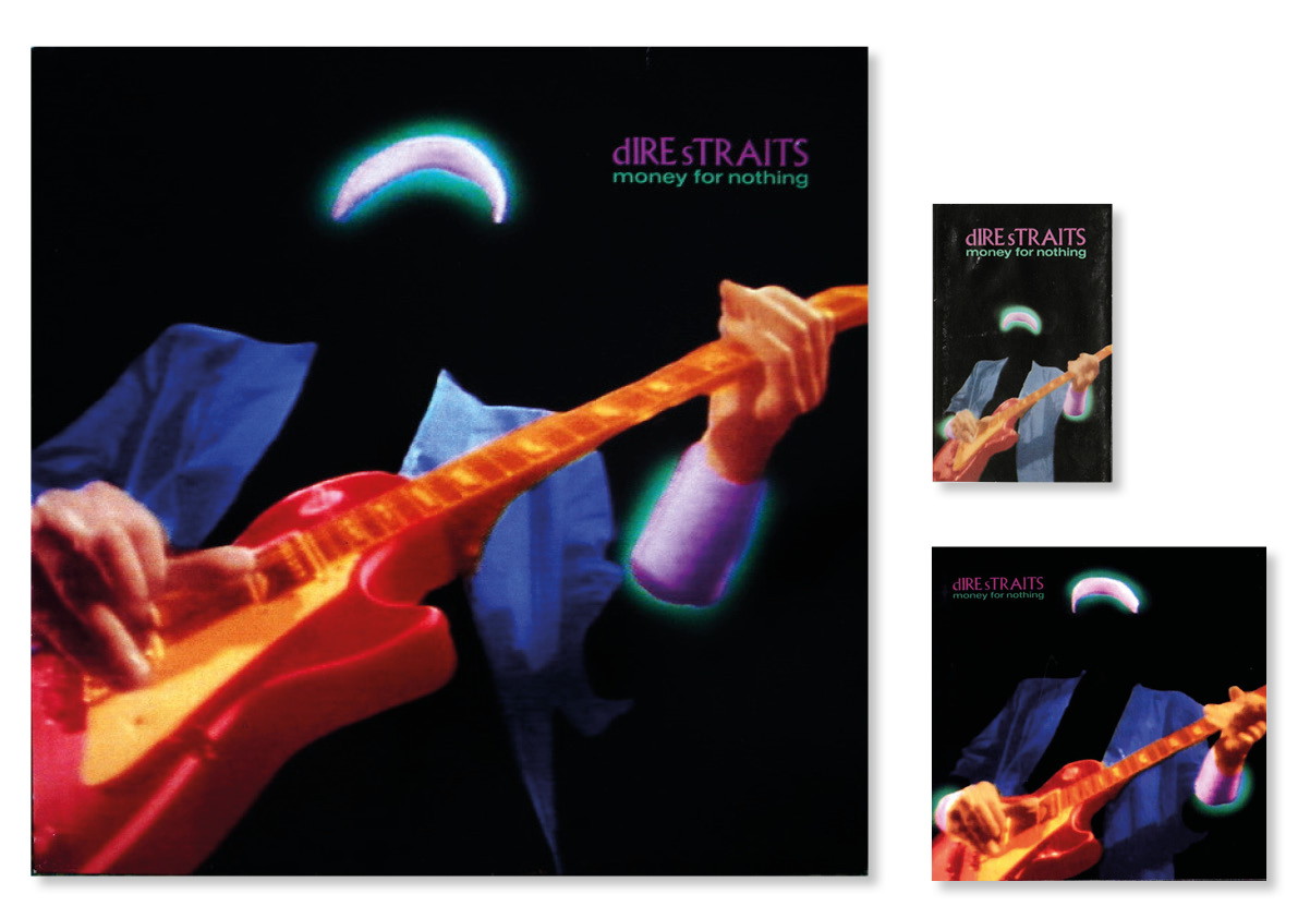
Dire Straits - Money for Nothing (1988)
Slight variations mark out the differences between formats for this greatest hits set. The subtleties between the cassette and CD versions require a magnifying glass to detect.
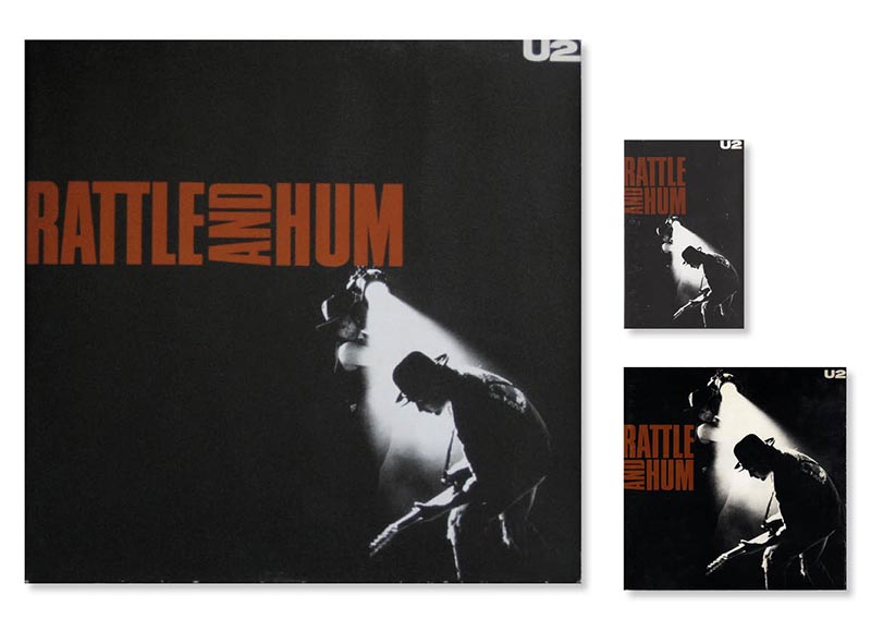
U2 - Rattle and Hum (1988)
The three versions of the cover for U2's next album differ only in composition, but it remains very successful.
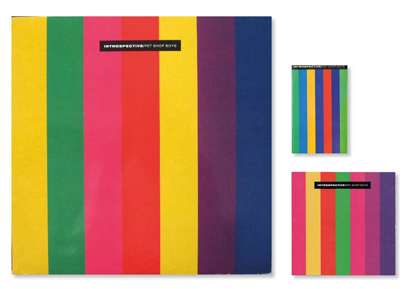
Pet Shop Boys - Introspective (1988)
Given the simple design of Pet Shop Boys third album, reproducing it on the three formats would have been easy, but by altering the colours, the design itself is subtly emphasised.
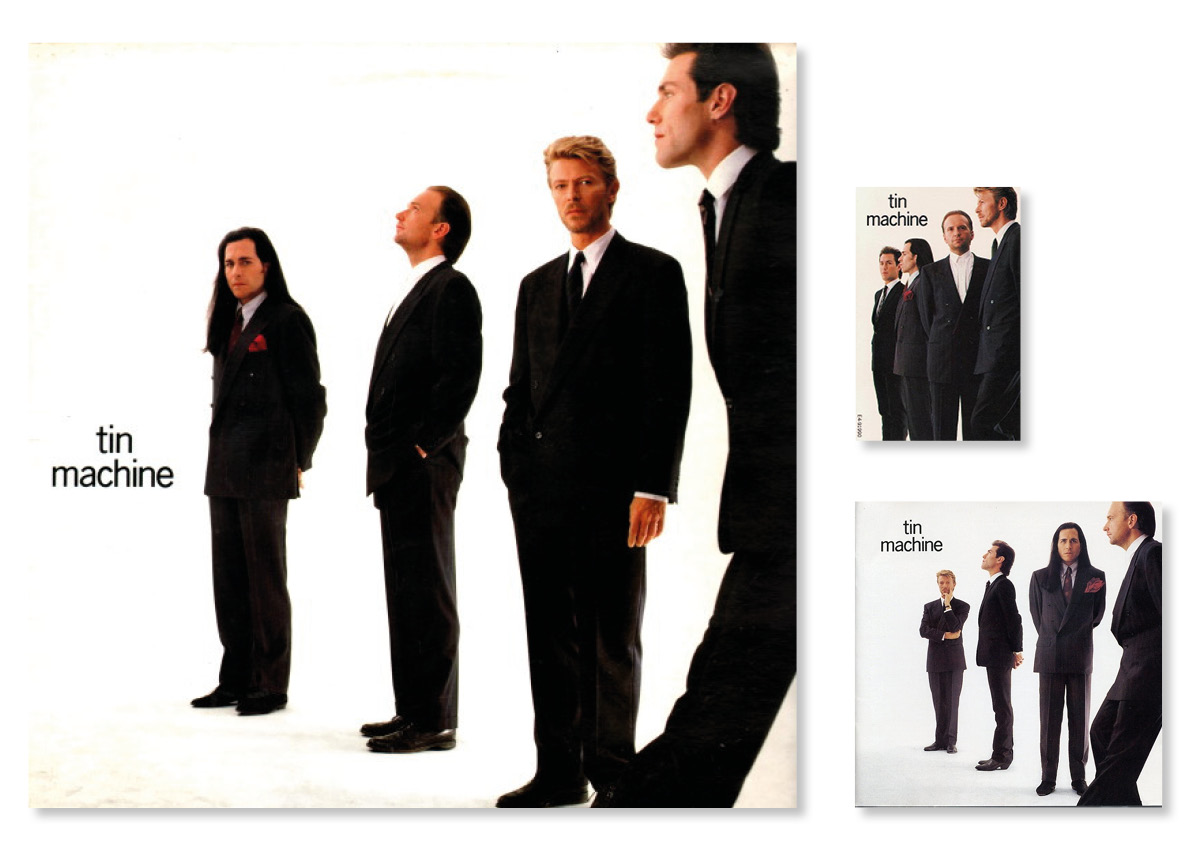
Tin Machine - Tin Machine (1989)
David Bowie had been a master of controlling his own image for a couple of decades before this project sought to anonymise him within the context of a four piece rock band. Even the three variations here compound the idea that he is just one of the lads.
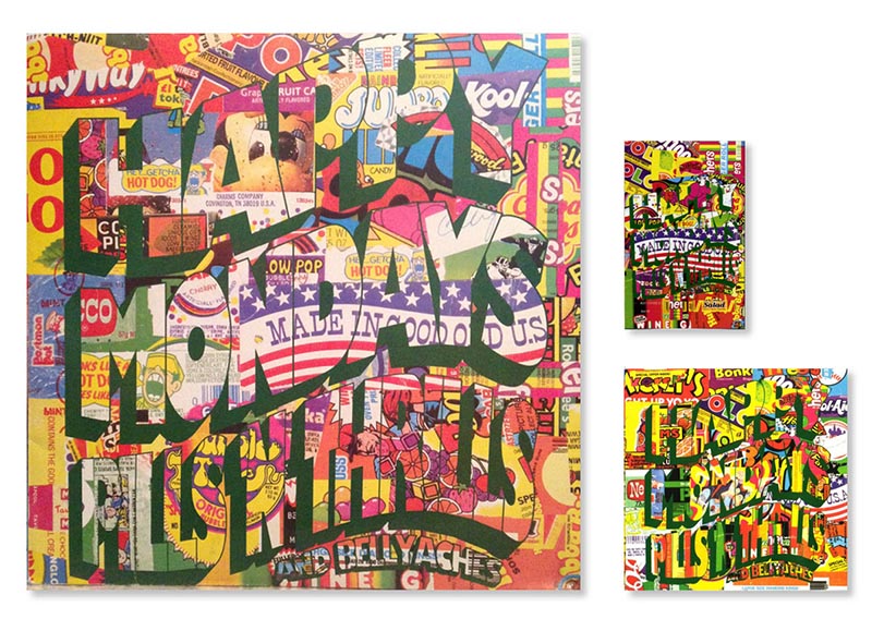
Happy Mondays - Pills 'n' Thrills and Bellyaches (1990)
Factory records had a reputation for employing great design and the overwhelmingly psychedelic cover for the Mondays' era-defining album was no exception. The image is so overpowering, one could be forgiven for not noticing that three different designs had been employed until looking at them side by side. All this was for nought however, because the original covers were quickly replaced due to legal action from the confectionary manufacturers whose sweeties had been appropriated. The new cover was still vivid, but lacked the satirical punch of the original.
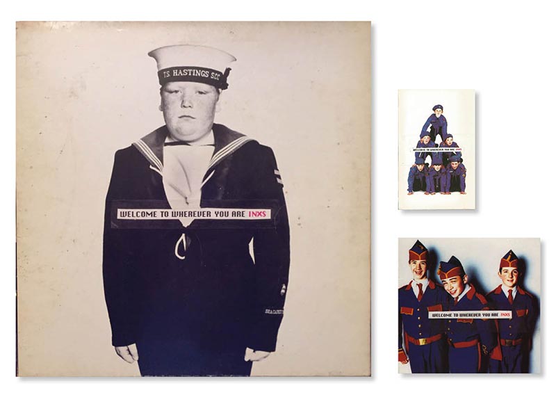
INXS - Welcome to Wherever You Are (1992)
A favourite. The designers flew in the face of the obvious by increasing the number of people on each cover as the images got smaller. As with many of the albums featured here, the design aesthetic was carried over to the covers for the singles, extending the narrative further. But that should be saved for another blog...
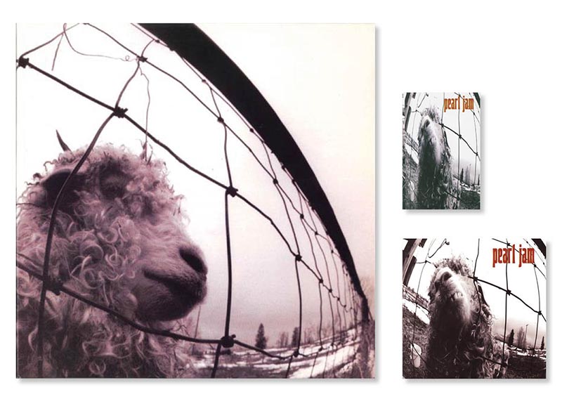
Pearl Jam - Vs. (1993)
The alternative covers for the vinyl and CD are great. The squished image used on the cassette is not.
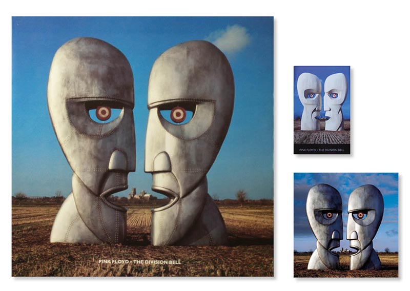
Pink Floyd - The Division Bell (1994)
Throughout their career, Floyd and Storm Thorgerson (designing here) came to embody iconic album design. They created yet another memorable composition for this album, that varied across formats. Other variations featured on yet more issues of the album in different territories.
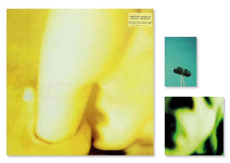
Smashing Pumpkins - Pisces Iscariot (1994)
Although a stop-gap release of out-takes and b-sides, perhaps the band took the opportunity of the somewhat minor nature of this release to be a bit playful with the cover. The LP and CD are cut from similar cloth, but the cassette cover feels a little conspicuous.
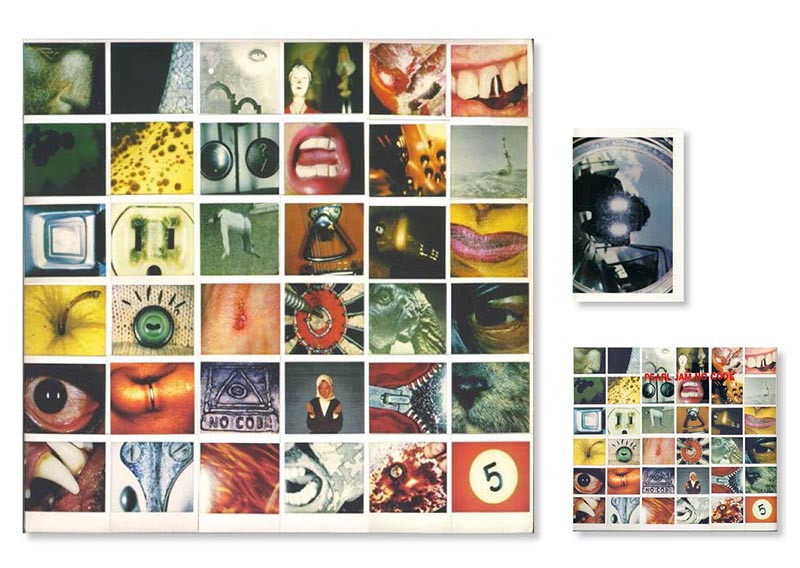
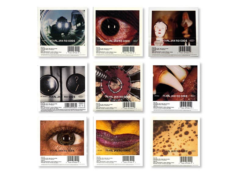
Pearl Jam - No Code (1996)
The entire design for Pearl Jam's fourth is brilliant, employing 144 different polaroids full of abstract meaning and connections. Personally I would have used the full 144 for the LP cover rather than mimicking the 36 on the CD. Both formats fold out to reveal the whole collage which collates to reveal a barely perceived icon. This layout was impractical for the cassette which employs just a single polaroid (at approximately 1:1 scale) for the cover. But, throughout different territories, at least 9 different coves were used.
