Why Colour is a Slippery Customer
In graphic design, the application of colour is as fundamental as anything we do, yet getting it to behave as we might wish is a frequently challenging proposition. Whereas the design of form and layout – the shape, proportion and relationships of various design elements – is often easy to control, the colour of those elements often feels like it’s doing its own thing… But why?
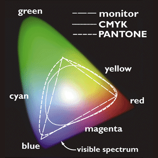
All colour spaces are not created equally
The colour space or gamut is the range of colours available to the designer, and depending on the output method this space can vary. Most design is done using computers which display using the RGB colour space, and most printing these days is done using CMYK. Not only are both colour spaces different, each is able to produce colours that the other is not. How can one effectively design with colours that you can’t see until they’ve been printed? But these two colour spaces are just the two most recognised colour spaces amongst a whole world of differing gamuts. There are countless variations of these two, created by different software, displays and printers. Indeed it’s probably true to say that each printer has its own unique colour space derived from the quirks of its design, even though we may not be able to discern the differences. As well as these two, there are more variations still, such as Pantone’s 12-colour derived gamut. We will soon enough be viewing designs with passive ink displays, that are starting to appear on e-readers, which of course will likely offer new and evolving colour spaces.
The fine art of calibration
As if this variation of colour space was not challenging enough, ensuring your equipment represents it accurately adds an extra layer of uncertainty. Monitors should be correctly calibrated in terms of brightness, saturation etc and this is a time-consuming enough process. Even then, many flat panel displays show differing colour depending on the angle you view it from. Look at your monitor from the side to see this effect at its most extreme. Calibrating printers for colour is also time consuming, but has its own challenges in that different paper stocks will alter how the colours are reproduced. A professional reprographic operation will have the time and experience to calibrate their equipment, but in many other offices, coordinating a large number of computers and printers means accurate calibration is a luxury. And once it’s done, it only takes a single glitch, perhaps the installation of new software to reset the calibration to factory settings, and you’ll need to start from scratch
Looking at it in a different light
Any printed or passive-displayed design can only be viewed when light is shone on it, the frequency of the reflected and absorbed light determines the colour we see. But light comes in many colours. Sunlight and fluorescent lighting is white, which offers the full frequency of visible light to be either absorbed or reflected and will give the truest possible rendering of the colours of the design. But incandescent light bulbs emit yellow light, and thus a small range of frequencies are omitted from the visual spectrum. Our perceptual centres counter-act this difference so that we are rarely aware of the difference in colour of our surroundings whether in daylight or under interior lighting, but the difference is there and will affect how the colour of a design appears. And of course, no designer can control the light quality that will fall on their designs when out in the world.
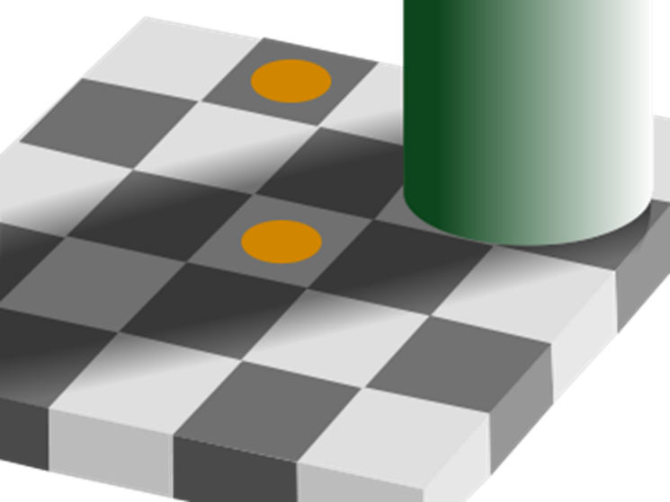
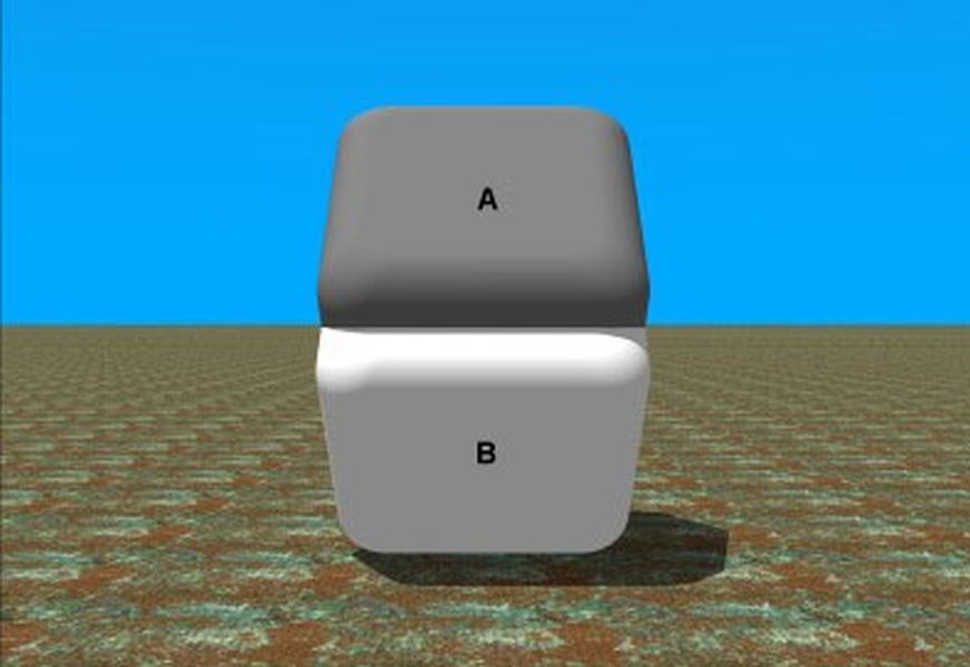
Optical illusions
But if we cannot control the light out in the world, we have even less control of the perceptions of our audience. The perceptive centres of the brain are immensely powerful and allow us to navigate the world more easily, but they can be fooled as these optical illusions prove.
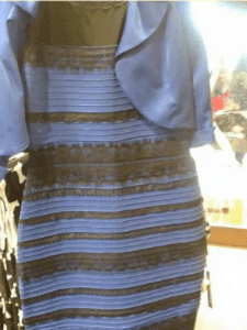
One of the most notorious recent illusions is that of the dress wherein blue and black were rendered gold and white to many but by no means all of the people who saw the picture. So, despite our best efforts to produce accurate colour, it can all be undone by the perceptual eye of the beholder.
What is to be done?
Given all this, how can a designer successfully manipulate colour? Personally, I don’t have the time or resources to calibrate all the equipment I use, and with much of my output appearing online, I have no control over how others have their devices set up. When I employ external printers, one of the things I am paying for is the expertise that ensures they are using the best possible equipment and have set it up and calibrated it – its not just about paper and ink! But even so, if I am designing with a flat panel display that is not calibrated, the colour I view will not be 100% accurate. How do I deal with this?
Unexpectedly, the best possible route I’ve found is the simplest. I just ask myself, 'does it look good?' Whether it’s on screen, printed in-house or externally, the colours will be different between each iteration, but as long as the design holds up within each version, I am satisfied. And in a way, we have our oft-fooled perception to thank for this – as long as the colours work within the context of the design, our brains can deal with vagaries of light, limits of colour space and inaccuracies in reproduction, and we rarely notice.