Lousy Graphic Design - Part One!
I sometimes meet the attitude that if graphic design has been released into the real world and if it represents a brand, company or person of renown, than it is necessarily of good enough quality. How many times have I heard the phrase "Well it must be good, otherwise they wouldn't have used it!" or "It does the job," or most depressingly, "Well, it must have worked, because it got us talking about it!"
Unfortunately, we are abounded by bad graphic design. It's there on the side of vans, in shop fronts and in the pages of magazines and newspapers. But one place you don't expect it is on the front of music releases from top artists.
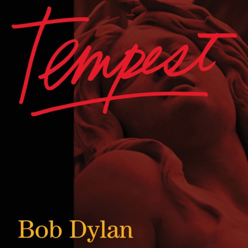
Not only is this album cover from Bob Dylan so badly executed, I find the utterly perfunctory nature of it totally depressing.
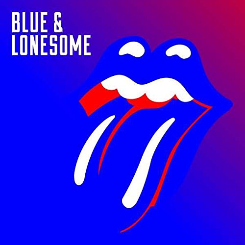
Fans waited over a decade for this new Rolling Stones' album. How come the cover looks like it was drawn up during a lunch break? For me, the use of RGB primary colours is most awful - as if they clicked on the first swatch presented to them. It's also outside the CMYK colourspace, which meant physical copies not only looked different, but had a drab washed out look to them!

Crikey. This is just rubbish.
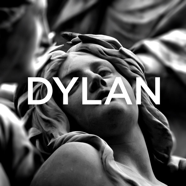
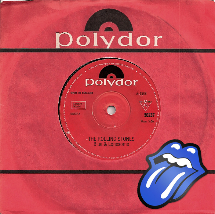
For fun, I drew up a couple of alternatives, during my lunchbreak. They wouldn't win awards, but I'll stand by them.