Five Design Ideas That are Totally Played
What starts as innovation, becomes cool, then on trend. Mass adoption and ubiquity may follow, and if they do, eventually the ideas become cliché, stale, and finally obsolete. As a designer, I occasionally get asked to employ ideas that haven't just gone beyond their 'best before' date, but their 'use by' date. It's understandable - clients see design that delights them and they want something similar. Anything original will be seen as unfamiliar and not on trend - though the hope is that we can be ahead of this curve. The challenge is to convince the client that deviating away from their initial desire for familiarity will generate work that is less prone to becoming dated.
Here are some design tropes that have definitely been over-used:

Wordles
It's difficult to remember a time before wordles were so prevalent. I imagine they were initially put together by designers who pored over their font choices and composition, spending hours going through many iterations until arriving at something that was both visually pleasing and informative. But, at some point an app was developed and now you can just plug in your list of words and a wordle pops out the other end. Design by algorithm. While the purist in me maintains that wordles put together by a conscientious and indeed conscious designer are superior, I've never done the equivalent pepsi challenge and when scanning a gallery of such constructions, I'm none the wiser as to which ones are automatically generated. Of course the upshot of this automation is ubiquity with wordles appearing everywhere from foodie magazines to quarterly business meetings. Maybe it's not the wordle's fault - maybe this fate befalls any idea that can be automated, but either way, it's played.
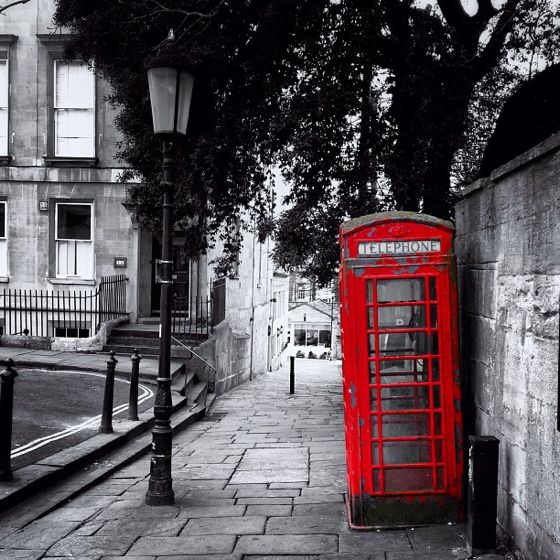


Colour Splash
Before photoshop, creating such images would have required pain-staking work in the darkroom. Again, the technological breakthrough of digitisation took something that was once striking and original and turned it into a cliché through overuse, and what once would have been used to advertise expensive perfume, is now clogging up rotating postcard racks on Shaftesbury Avenue. It's been played.
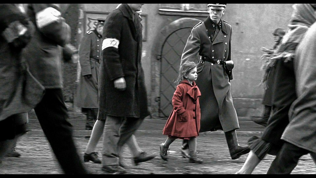
Even world class talent is not immune to using an on-trend idea and Spielberg's Schindler's List employment of the girl in the red coat is an obvious example. It's a testament to that film's power that even now, the subsequent over-use of the technique doesn't detract from its devastating effect in the film.
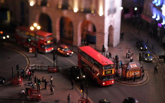
Tilt Shift Photography
AKA The toytown effect. Tilt-Shift lenses, the hardware needed to take these pictures are neither widely available or cheap. But of course achieving a similar effect in photoshop is just an online tutorial away. Second unit photography in the film The Social Network and the opening credits to the BBC's Sherlock will forever be pinned to such a specific time due to their use of Tilt -Shift. It's still kind of fun, but it's been played.
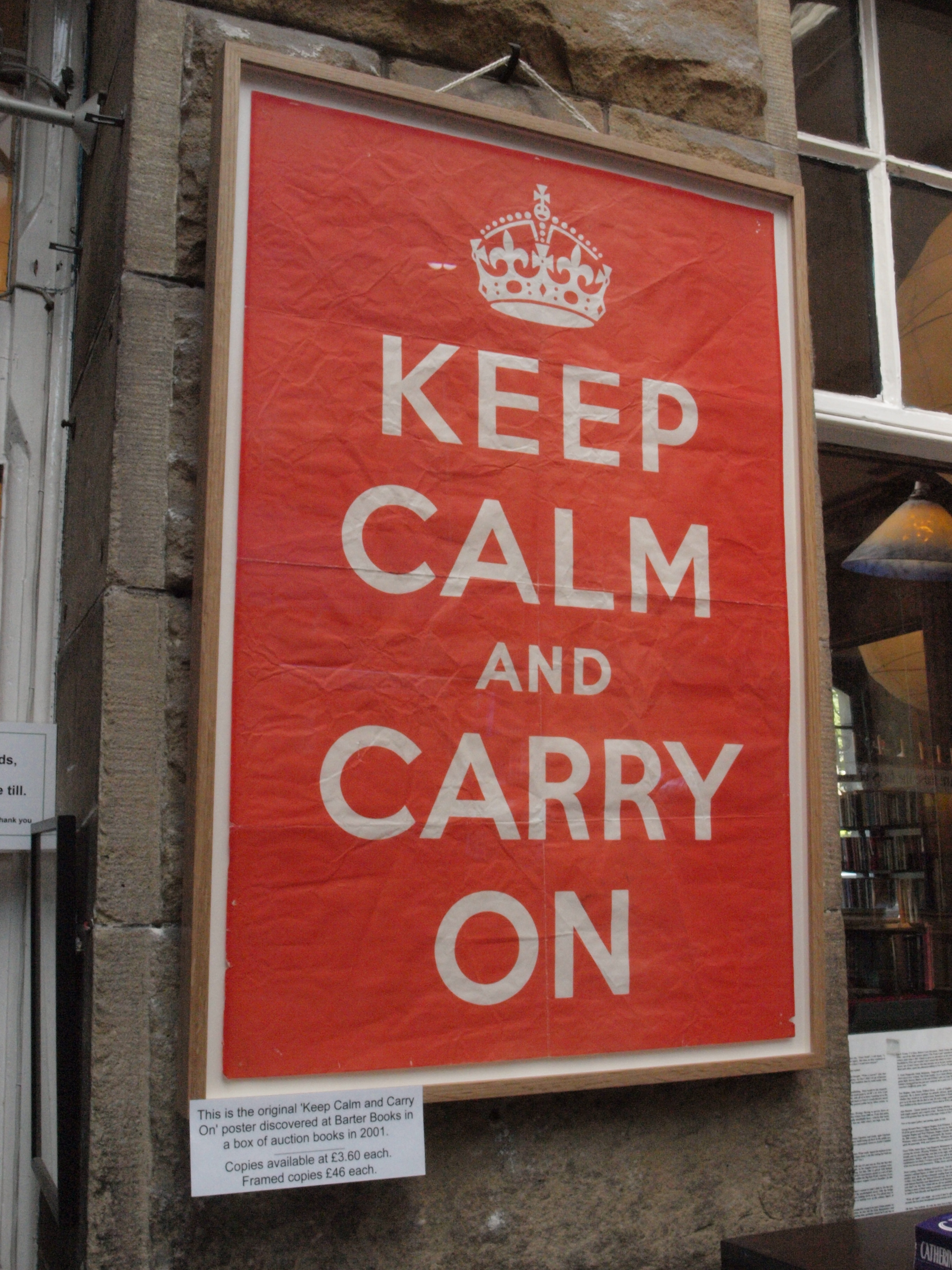
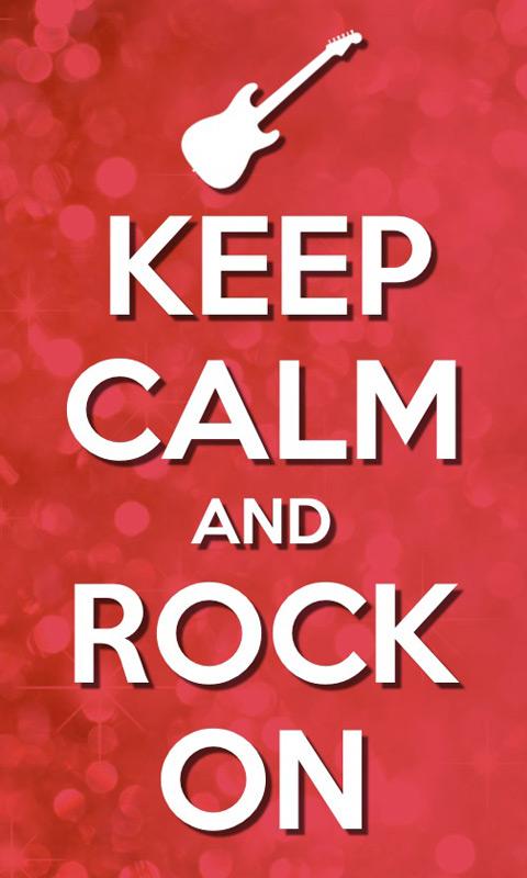
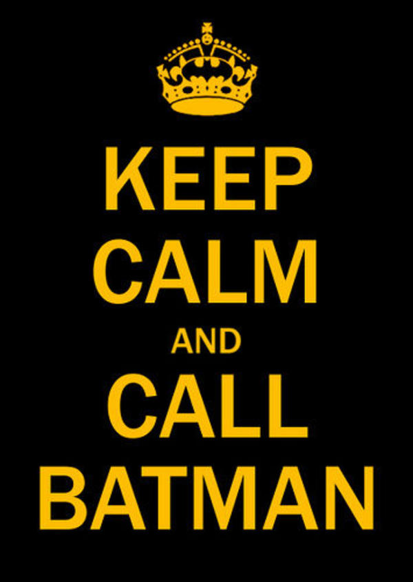
Keep Calm and...(insert words here)
Enough already. It's been played.
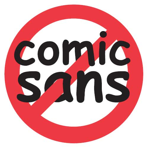
Hating Comic Sans
The ubiquitous hand script typeface in all its ugliness did at the very least free us from the tyranny of Times New Roman. Even though most of the vitriol aimed at it has been justified - its appearance on gravestones and police riot vans is unconscionable - I think it's time we gave it a rest. The problem, of course, is that people with no experience or even interest in typography will wax disdainfully on comic sans and there's little us 'real' designers hate more than mere civilians muscling in on our opinions. Besides, comic sans has its place. Due to the nature of its small 'a' it has found a natural home in schools where its sheer readability is a boon, and apparently it is among the best typefaces to use for those suffering from dyslexia. And as for us 'real' designers, well, we're hating on Papyrus now. Hating on Comic Sans has been played.