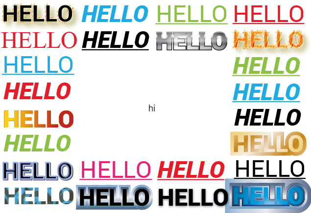
Making it Stand Out

One of my very early professional design jobs was drawing up an advert for a shop to appear in a magazine. One of the instructions was “I want the word ‘sale’ in huge red letters taking up the top half of the page.” I can’t remember if I added an exclamation point.
Recently while working on a document I was instructed to make the title bold and underline it. And later on, for a print advert for a magazine, I was asked to italicise a particular line. “Why?” I asked. “To make it stand out,” was the response in both instances.
But why did we want this particular sentence to stand out? It is referred to as the 'call to action' and was fairly prominent on the advert anyway, but did it need to stand out? And what does it mean to ‘stand out’? Do we want it to be the dominant part of the design, the first thing that grabs the attention of the viewer? Is the ‘call to action’ more important than the overall message or the brand?
When one thing stands out, everything else around it is diminished. Is that what we want? A design should work harmoniously as a whole, not a collection of separate elements all jostling for prominence, all calling out for attention. The design itself should stand out in its surroundings – if it’s a magazine advert, you want it to stand out amongst all the other adverts in the same magazine, and one way to prevent this is by creating an imbalanced, noisy design.
Of course, certain elements in a design are more important than others. The title of a document is more important than any body copy, but that doesn’t mean it has to stand out. Its position at the top of the page is enough. It doesn’t need to be underlined or bold (and I prefer to use lighter typefaces for my titles, where the glyphs can be larger without being as imposing). And if it feels like an element is not drawing enough attention to itself, then perhaps the best way to give it a boost is not to have it shout louder, but to tamper down the competing elements. If you want to make your headline more prominent, perhaps you don’t touch it, but just give it a bit more space, or reduce the scale of the copy beneath it.
So, let’s not design things to stand out. Let’s design everything to stand out.