Get On
Helping end digital poverty via a community hackathon
Community Hackathon
2023
- UI/UX Design
- Branding
In summer 2023, I was invited to take part in a community hackathon, run by Tech4Good South West. We assembled on Monday morning with the goal of presenting a fully-realized concept and working prototype that Friday, to our constituency MP among other local stakeholders at a public event.
Our team was made up of coders, developers, and experts in the local community and issues surrounding it. As a designer I had two principal areas to focus on, branding and UI/UX design, but like everyone, I also contributed to the broader conversation about the issues and challenges we were tackling.
Project Brief
Our brief was broad but daunting; devise a product to help cross the digital divide. An often unheralded symptom of poverty, the digital divide describes all the obstacles that prevent people from accessing the internet. Although once thought of as a luxury, online access is now a necessity, and any denial of it can have the knock-on effect of restricting access to other essential services.
Our first sessions consisted of brainstorming and we quickly identified a number of factors that contributed to the digital divide; financial limitations, technical knowledge, user confidence, local infrastructure, availability of help.
Already we could appreciate this problem was multifaceted and we could not hope to tackle it entirely. We instead decided to address a very specific issue and see what difference we could make. We were aware that many ISPs offer ‘social tariffs’ - internet services aimed at those who may be disadvantaged, offering more affordable contracts, contracts that are easy to step away from and dedicated support. The problem we focused on was that these tariffs were seldom publicized as well as the ISPs’ flagship deals, and many comparison sites did not include them. We decided a simple website that allowed users to search for social tariffs and compared them to the regular market place offerings would be our solution.
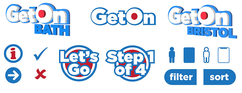
Branding
While our developers got to work coding the back-end that would give our site functionality, I was engaged in developing a brand.
It was agreed that the brand should be simple, uncluttered and above all friendly.
I decided the website would be called ‘Get On’ and wrote a quick strap-line for it.

This was exactly the kind of no-nonsense straight talking we felt our audience would welcome. The primary color pallet was intended to be straightforward and welcoming and critically all-inclusive. The design in general was also intended to not overwhelm the user, as we would be presenting a lot of information and we didn’t want to clutter our site with extraneous detail.
I drew up complimentary logos and icons.
Prototyping
With branding in development I also drew up a simple user journey. Although our very short time-frame limited what we could achieve, we used this to our advantage and created as simple site map as we could.

A functioning prototype can be seen here.
Conclusion

On Friday we presented the working prototype to an enthusiastic audience. Although we were not yet at a finished product, we had a clear roadmap for what that product would look and feel like, and the week was regarded as a great success reported by local press.