Tanzania Conservation
Team project for UI/UX bootcamp
Bath Spa University Skills Bootcamp
Group project
2023
- UI/UX Design
- Tools: Photoshop; Illustrator; Miro; Figma
The Brief
Tanzania Conservation is a charity that focuses on the preservation of the big five - elephant, lion, leopard, buffalo and rhino. The charity is seeking to increase its turnover while promoting its values of Preserve and Protect.
Working as a group of four, we were assigned the task of developing a new website and CMS and over 12 weeks engaged with the full process from research, via ideation, prototyping to delivery.
Research
Researching similar websites that operate in the same market yielded valuable insights.

Uganda Conservation Foundation
A very similar charity operating in a different country. This gave us good examples of messaging as well as use of photography and colour to convey its brand.

African Wildlife Foundation
A continent-wide charity that focussed on similar themes. It is more generalised, but helped clarify the key themes common to many conservation efforts.
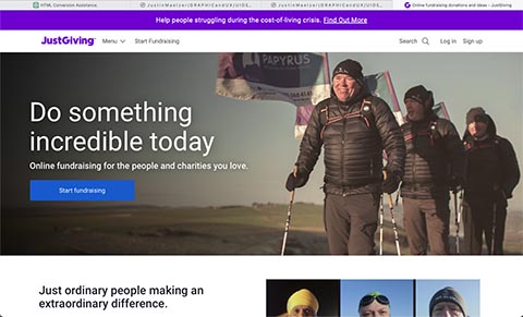
Just Giving
A broader fund-raising portal, this was useful in demonstrating techniques that encourage donating as well as engendering lasting connections between fundraisers and their donors.

PETA
This was given as an example of a bad website. Overstuffed with harsh images and oppressive typography - this triggers a stressful response in users, causing anxiety and even anger. Although we felt that this confrontational approach was the intent of this charity, we were clear that this approach was antithetical to our aims.
User Profiles
User profiles were devised to better understand the different journeys they would take through the website.
- Casual donor - Will only have a quick interaction with the website but still be keen to donate. This should be easily achieved with as few pain points as possible. The user should not be subjected to the ‘hard sell’ where they feel pressured into donation.
- Regular donor - Someone who sets up a regular direct debit. It is important to show them how their donation is helping and keep them engaged with the ongoing work of the charity. The more enjoyable their experience is, the more likely they are going to become a vocal advocate for the charity.
- Potential employee - As well as leading them easily to a list of vacancies, the website as a whole should clearly communicate the charity’s ethos and present itself as a positive employer.
- Activist - The website is not solely aimed at capturing donations, but also disseminating information about the need for conservation in Tanzania and the positive effect the charity is having. From school children writing essays, to social media user wishing to engage with positive stories, the website should be the authoritative first and last source of information.
Site map

By considering the different journeys the various users should take, a basic site-map was drawn up. Rather than map out each page, we settled on an overall structure with the flexibility to tweak it further along in the development process. We decided to do without an explicit news / update / fund raising page and put the animals themselves front and centre - from these starting points, users can access the individual stories. Not shown on the map but explicitly discussed was the need for there to be no dead-ends that users could get stuck in. Every page would have links to similar pages, as well as a navigation bar that always provided access to the main pages of the website.
The user journey should flow naturally, driven by their own curiosity.
Wireframing
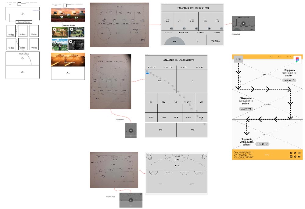
A number of wire-frames were drawn up by different team members. On comparison it was felt that a design with fewer elements was desirable. It is easy to pack too much information on a page and thus overwhelm the user. We opted for a design with fewer elements per page, but more pages overall - it was hoped that with each page being easily digestible, there would be an impetus to keep moving through the website creating a journey that the user felt in control of. We also envisaged a design that would lead the user to naturally scroll down the page. Although paragraphs of text would do this, we felt a visual way of communicating this would work better, and a “path of interest” was added - early ideas included a trail of paw prints leading down the page. Moving from wire-framing to prototyping we added photography and some colour to get a sense of how they worked on the page.
Branding
Before moving fully onto the prototyping stage we developed a brand. Although this gave us a good starting point, it was necessary to review and develop it further once incorporated in the designs. Only after seeing it in use could we assess how successful it was.
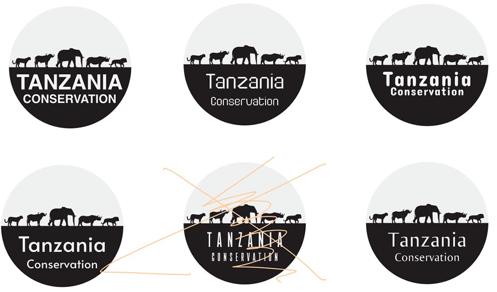
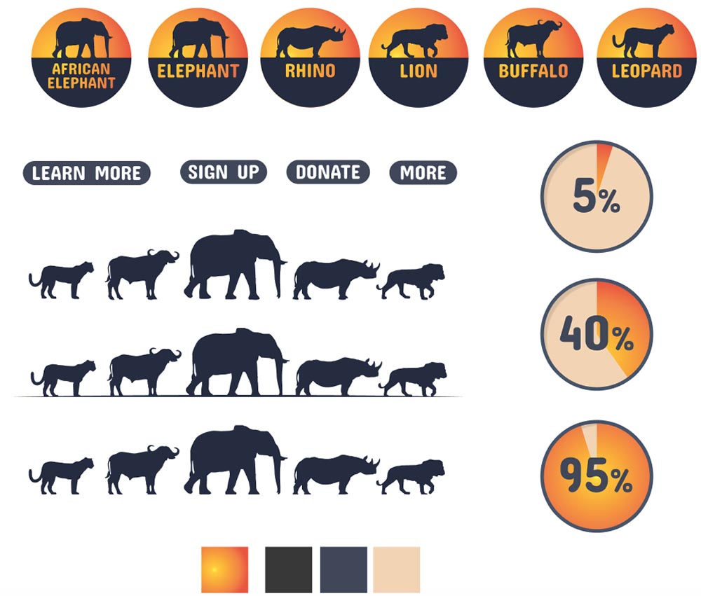
Logo design

A number of concepts were sketched out. We settled on the parade of the big five. This simple design would be clear even at a small scale. The colours represent the setting sun, and give the logo a metaphorical meaning that was carried over literally into the copy on the landing page.

Typography
Working with the logo we tested a number of typefaces and decided on Concert One. After some development we felt that this typeface was not strong as a headline font - it works best when constrained either in the logo or in buttons.
For headlines we chose the serif typeface Playfair. We elected to use a straightforward sans serif typeface for body text and opted for Calibri. Using these three typefaces in distinct places but with differing weights gave us typography with enough flexibility to create many different pages, but still maintain the consistency across the whole brand.
Colour
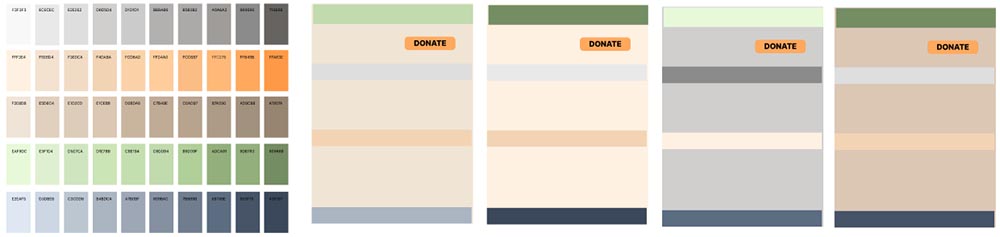
We used our photographic research to define a colour palette. This centred around earth tones with strong colours for emphasis, dark blues, greens and oranges.
Photography

Photo selection is one of the most overlooked elements of design. However, when any project relies heavily on photography the choice of photo is as important as any other design discipline. As we worked through online photo collections collating potential images, we worked to a number of principles that guided decision-making and helped form the look and feel of the site.
- Consistency of tone - the same subject can be captured in any number of ways that affect the colours you see, be it the surroundings, the ambient light and any filtering / post production the photographer chooses. The photography selected needs to strike a fine balance between consistency and variety.
- Negative space - When using photos that fill up the entire page (or at the very least the width of a page) the image can be overwhelming. We sought out images that had negative space within them. Having the subject not take up the whole photo looked less busy, and also gave room for text and buttons as needed.
- Eye contact -Wild animals are not necessarily cooperative subjects, but we were able to hunt down enough photos of the animals looking directly at camera. This sense of eye-contact with the user was crucial in engendering a sense of connection with the subjects that would hopefully lead to greater engagement with the cause.
These elements were drawn together to make a useful albeit incomplete web kit that would inform the next stage of development.
Prototype
Using Figma, we generated a number of pages to demonstrate the design and functionality of Tanzania Conservation.

The landing / index page was kept deliberately light of text, preferring to allow the magnificent animals themselves to generate engagement. The ‘line of interest’ was dropped as designs for it felt too busy and detracted from the content. Instead, the choice of pictures and placement of text subtly encourage users to keep scrolling. The minimal content on the landing page is intended to steer away from the hard sell and entice users to travel further into the site.
The navigation bar was kept as simple as possible. Although the logo we settled on used the setting sun colour scheme, when placed alongside the vivid photography, we felt the design needed to draw from a subtler palette. As a result, we found the design worked best with the soft earth tones (dare I say beige?) With the stronger colours used for text, and the images carrying the weight of the visual look.

The Big Five are the focus of the fund-raising activities. From this hub, users navigate to pages dedicated to each animal, and then specific news stories, updates and campaigns. It was envisaged that fund-raising be broken down into individual campaigns that each have a target in terms of aim and fund-raising total. Not only would this allow donors to see explicitly where their money went, but also provide valuable feedback to the charity by providing a metric by which the various fund-raising streams could be gauged in terms of popularity and user engagement.
Although any user can make a quick donation, it is hope that a lasting relationship with users can be cultivated. This is commonly done with a monthly direct debit, and although many people are happy to do this and essentially forget about the charity, we wanted to encourage a much richer relationship between the charity and its regular donors.
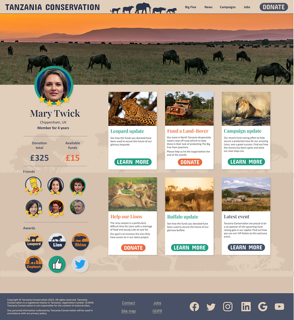
The user page here allows an element of customisation and community. Donors are encouraged to set up a profile, to connect to their friends and share what campaigns they are engaged with. They get a bespoke news feed which shares updates on the campaigns they have donated to and calls for funding other projects that they are more likely to be enthusiastic about. Even if the donor is signed up to a regular direct debit, their donations are not assigned until they decide which project they wish to support. With each new regular donation they are able to support more campaigns. This function is gamified in the form of ‘badges’ and ‘awards’ that are won when they donate to particular campaigns, or take part in other positive activities, such as sharing their experience via social media. It is intended that for a regular donor, visiting Tanzania Conservation to see how their funds are being used is a regular and fun event.
You can test the Figma prototype here.
Final thoughts
The working prototype for Tanzania Conservation was well received, although the further it was developed, the more we realized there was so much more we could do.
If this project were to move into real-life, the next stage would be user testing, especially of the members pages. We would also want to work closely with the charity’s communications team to bring the website and other social media portals together and coordinate the deployment of campaigns and updates.