Now That's What I Call Graphic Design
The Now That's What I Call Music series represents an unbroken thread running through popular British culture that stretches back to 1983. More reliable than even the seasons, every four months a new iteration appeared on the racks of our record stores (then supermarkets, then online...). Stuck in a graphic design rut since the last millennium, the unwavering homogeneity of their covers may be seen by some as a comfort, but actually speaks of creative flaccidity. It wasn't always like this. For a few years in the 80s, Now were releasing records with stylishly elegant covers, born of a graphic design arms race with their bitterest rivals...
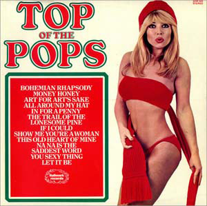
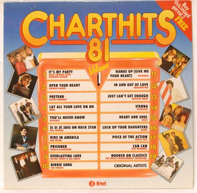
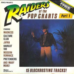
When the first Now That's What What I Call Music compilation was released in time for Christmas 1983, it ushered in a quiet revolution. Until that point various artist compilations of singles had either been made up of lifeless ‘soundalike’ cover versions, frequently in lurid covers featuring alluring girls (cf Top of the Pops collections), or were issued by individual labels and so unlikely to be especially full of hits. Now’s innovation was two-fold. Firstly by creating an alliance between Virgin records and EMI, they were able to draw on a larger pool of releases, and secondly, the timeliness of their release - the compilation came out when some of the tracks were still in the Top 40. The freshness, quantity (30 songs) and quality of the music (11 number ones), combined with a TV advertising campaign guaranteed success and many pop fans must have been unwrapping volume one on Christmas morning in 1983.
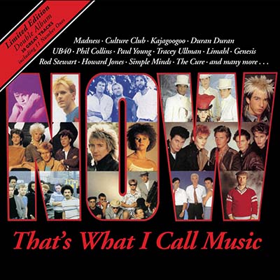
The design of that first cover is rather uneventful, using little more than the artists’ publicity stills to sell the product.
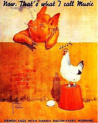
The title itself came from a poster for Danish bacon, which was reproduced on the back of the album.
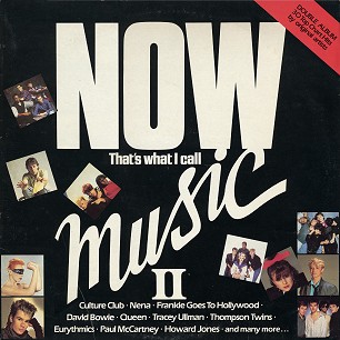
Volume 2 had an equally desultory cover.
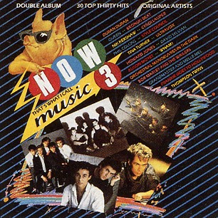
Volume 3 represents an advance with the introduction of the three circles logo and emergence of the pig as mascot. The fourth volume is a variation on its predecessor, but the designers were for the first time acknowledging a narrative with the series. Now had now become a brand.
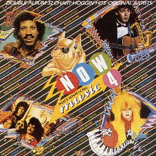
Now 4 also marked a milestone and to this date (after over 100 volumes as of writing) an anomaly: It was the only Now compilation not to hit the Number 1 spot. It was held from that summit by The Hits Album.
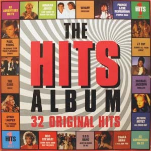
One can understand why labels would shy away from this type of compilation - they effectively killed their singles market. But once Now had established itself, the genie was out of the bottle. Sony BMG and Warner Music came together for their response to the Now series and released The Hits Album concurrently with Now 4. Its artwork was hardly any more iconic than Now’s, not even having a farmyard animal on its cover. It too boasted of 32 hits (only one of which was repeated on Now 4 - inexplicably, Ghostbusters by Ray Parker Jr) and a gaggle of number ones. Maybe the Hits roster of artists was better - this first edition features Michael Jackson, Prince and George Michael. Maybe it was the appeal of the new, but in this first chart showdown, Hits walked away with the victory.
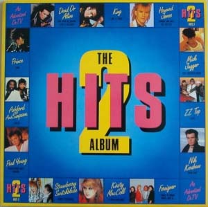
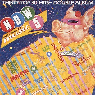
Hits 2 was released in the spring of 85, whereas Now 5 appeared that summer. Pocket money would comfortably stretch to both of these. The Hits 2 cover represents a variation on its predecessor. Now 5 brings the pig front and centre, the artists’ photos removed entirely from the cover, only their names appearing - the brand was everything now.
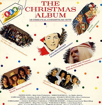
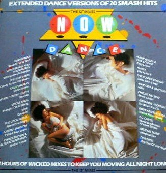
Indeed, with The Christmas Album and Now Dance, the brand was strong enough to effectively diversify.
But both sides knew the real battle was coming - Christmas 1985. And even though they had a great set of artists and a successful brand, Now had the smarts to know that how an album looks on the racks of your local Smiths still has some impact and drafted in designers Quick on the Draw.
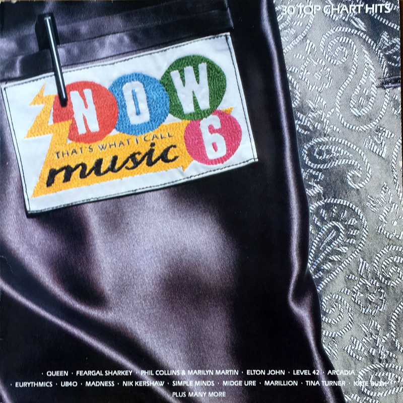
Now 6 represents a leap in design terms from the previous edition - the pig is gone, the logo remains, this time rendered as a stitched label on the inside pocket of a rather snazzy jacket. The artist’s names are now listed at the foot of the cover (an area often covered by other LPs in a rack) and are clearly almost irrelevant to the brand now. It immediately alludes to quality and lifestyle that was affluent (in the 80s) and next to it, Hits 3 really does look like yesterday’s news.
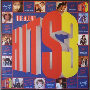
Now 6 hit number one for Christmas, Hits 3 was at two.
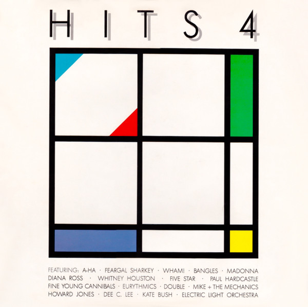
Hits responded somewhat in kind, with their fourth edition in spring ’86. The purely graphic approach still seemed somewhat less than Now’s physical construct, but their dedication to minimalism in a marketplace known for the exact opposite is laudable, and Hits 4’s Mondrian inspired cover is still a favourite. And I confess, I didn’t notice the large numeral 4 for years.
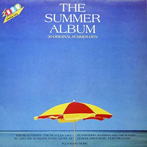
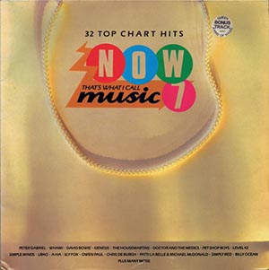
The success of the Christmas album spurred Now to release another thematic compilation, The Summer Album. It was followed only a month later by Now 7 featuring a luxury shopping bag - even if the logo was a graphical overlay, the large expanse of negative space is cool.
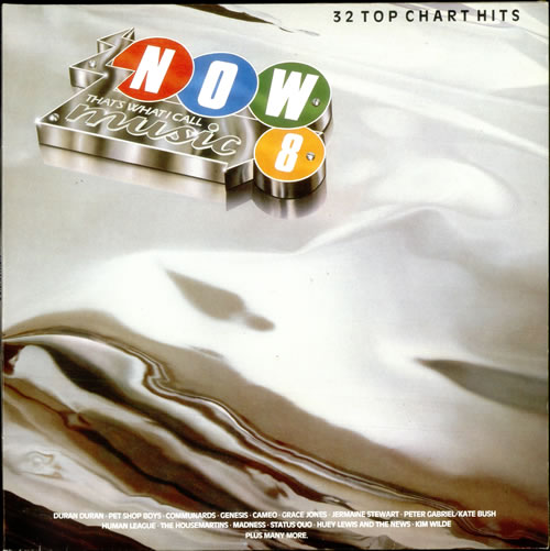
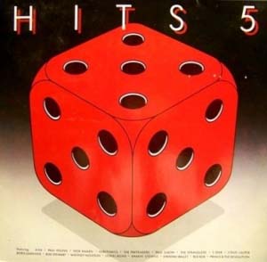
Christmas ’86 brought Now 8 with its airbrush metallic vision, maybe car bodywork? Again negative space rules. Hits 5 by comparison is a bit naff.
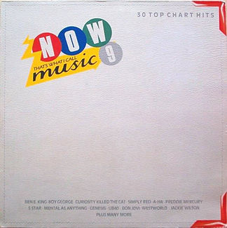
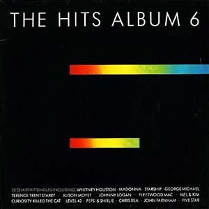
Spring ’87 brought Now 9 and its ‘folder’ cover. Hits 6 (summer 87) went even further with its elegant minimalist cover (and a numeral 6 that also took me a while to see). With both series delivering stylish covers, was this the golden age?
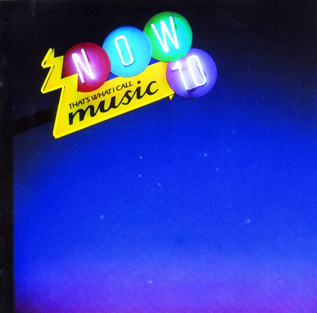
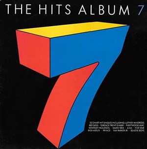
Christmas ’87 gave us Now 10’s neon sign. Hits 7’s cover was weak. As a brand, they hadn’t established a solid aesthetic narrative. (note: the images I have sourced do not always have artists listed on the cover, even though the vinyl editions I have do)
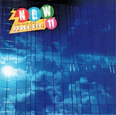
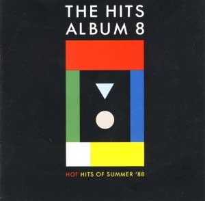
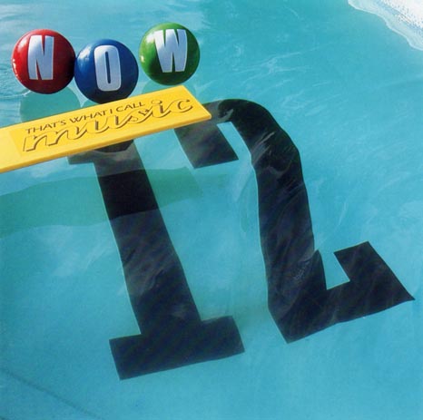
Now 11’s spring ’88 release featured lush blue skies against a skyscraper facade. For the first time outside of Christmas, the two rivals went head to head in the summer of ’88. Now advanced to a wholly physical design and by now the brand was so strong they could do away with elements of it - the zig zag shock from the yellow bar and the number in a circle sit this one out. It also screams ‘summer’. Hits 8 meanwhile is dullsville.
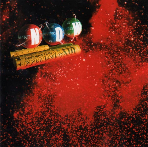
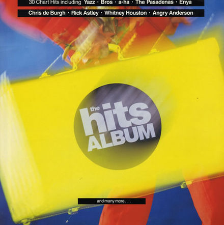
In Christmas ’88 Now XIII (hey, roman numerals) got all Sci Fi. Hits dropped the 9, and it looked like they were hitting reset on their brand with this garish, unlovely cover.
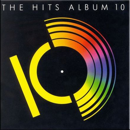
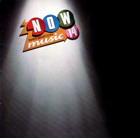
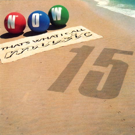
Hits 10 in spring ’89 marked a retreat and picked up the narrative from volume 8, with the best cover produced since Hits 6. It hit number one, but perhaps only because it didn’t go head to head with a Now album. Volume 14 with its art gallery had come out two months earlier. Now 15 that summer saw the beach balls re-inflated for a trip to the seaside.
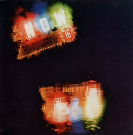
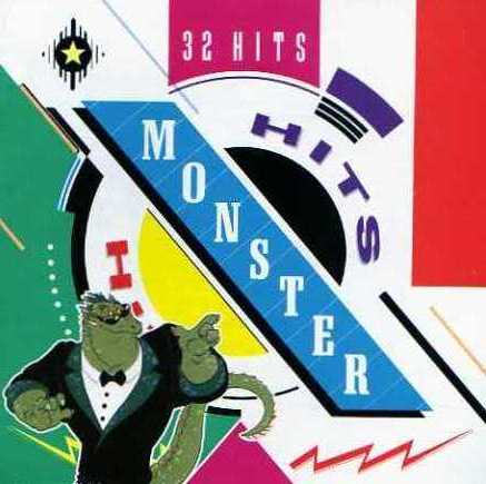
Christmas '89 gave us Now 16 with its smouldering fireworks (an actual display was made and photographed over a lake at Pinewood studios) echoed volume 10, two years previously and effectively bought this classic era of covers to a close. Hits response was another total rebrand - they were now Monster Hits. And their covers were awful, effectively waving a flag of surrender.
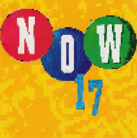
It is a shame then, that once the arms race was over in spring ’90, budgets must have been cut (fireworks and swimming pools don’t come cheap!). Now offered this turgid ‘computerised’ variation on their theme. This is also the era when CDs became the dominant unit and with their shrunken covers, visual impact is lessened.
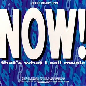
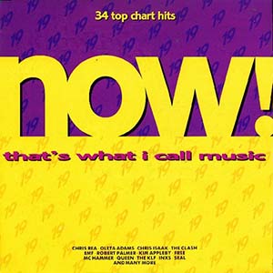
Now 18 and 19 drop the three circle motif and design wise, they were a bit lost in the woods.
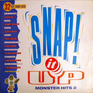
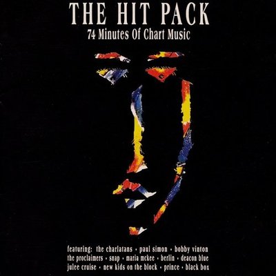
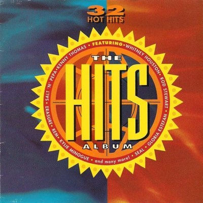
But not nearly as lost as Hits were during this era.
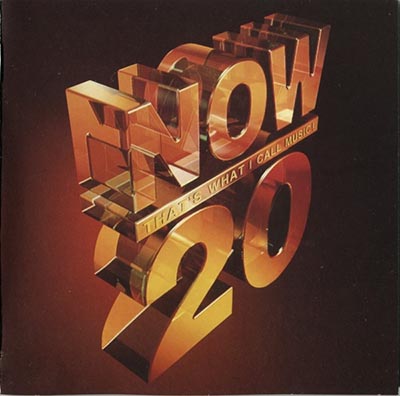
The new paradigm was established at Christmas ’91 with Now 20’s CG monolith. I wonder if the art director behind this rather unexciting, though effectively executed design had any inkling as to its longevity.
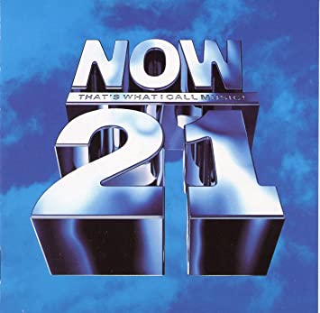
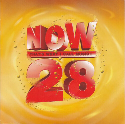
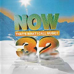
Variations on this theme graced CD covers, three times a year for the rest of the decade, fluctuating slightly, but offering nothing new.

By volume 36 (spring 97) the aesthetic establishes itself even more rigorously, and amazingly all these years later we’re still there.
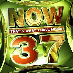


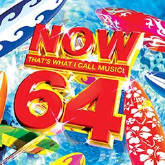
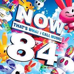
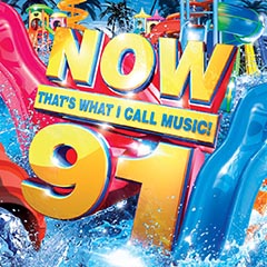
Summer editions are full of flip flops and surf boards.


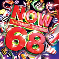


Winter editions bring snowflakes and baubles.

At volume 113, Now is still churning out the same design three times a year, oblivious to taste, innovation or creativity. It is, as the French would say ‘La mort de tout sentiment’: The death of all feeling.

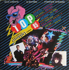

Volume 100 came and went. The Now brand has released a series of genre-based compilations, has been re-packaged for other territories, plagiarised and has even revived the three circles format, though rendered as blandly as the rest of their output. And so on they rumble, no end in sight... And little creativity either.
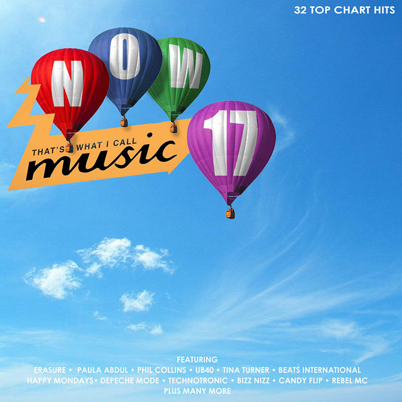
And finally, here is my concept for what could have been Now 17, had they continued the design narrative from Now 6 to Now 16.