Design Blog

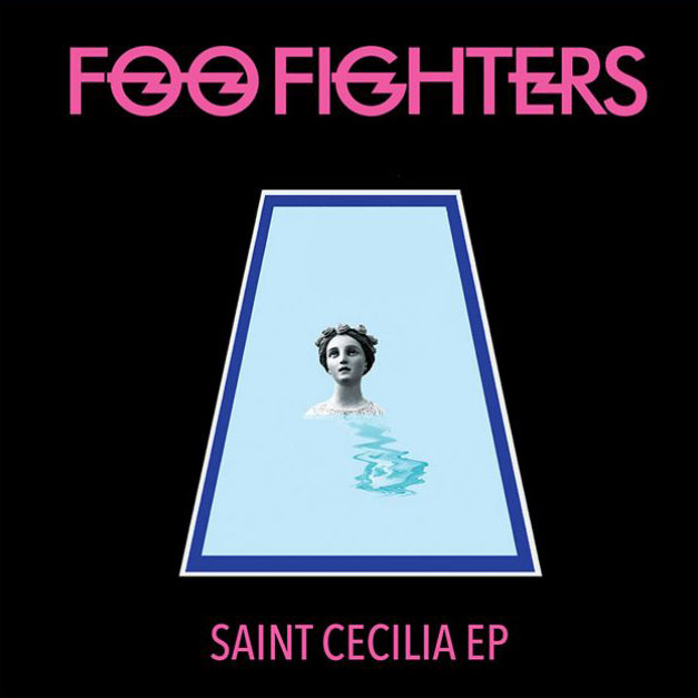
Photoshop’s Generative Fill Attacks Album Cover Art
Photoshop's new generative fill feature is let loose on classic album covers with surprising results.

Graphic Design in the age of Artificial Intelligence
If you are a designer, are you worried about the rise of AI? Should you be?

Now That's What I Call Graphic Design
A look at the revolutionary graphic design for the Now That's What I Call Music series of compilation albums, and the ensuing arms race against The Hits Album.

Making it Stand Out
“I want the word ‘SALE’ in huge red letters taking up the top half of the page.”
“Why?” I asked. “To make it stand out,” was the innevitable response.

Design for Three Formats
Exploring how designers tackled album covers during a brief era when three different formats were prominent.

Five Design Ideas That are Totally Played
What starts as innovation, becomes cool, then on trend. But sometimes the ideas become cliché, stale, and finally obsolete. Here are five of them that are totally played.

Why Colour is a Slippery Customer
In graphic design, the application of colour is as fundamental as anything we do, yet getting it to behave as we might wish is a frequently challenging proposition.

Lousy Graphic Design - part one
Just because it appears on the cover of albums released by world-class stars, doesn't mean it's any good.